

AP Syllabus focus: 'A Maxwell-Boltzmann distribution graph represents the energies and speeds of atoms at a given temperature.'
Maxwell-Boltzmann distribution graphs are a visual way to describe gas motion. They show that atoms in a gas do not all move with the same speed or possess the same kinetic energy.
What the graph represents
A Maxwell-Boltzmann distribution is a statistical picture of many atoms in a gas sample at one temperature. It does not tell the exact speed or energy of one chosen atom. Instead, it shows how the atoms are spread across a range of possible values.
On these graphs:
the horizontal axis gives either speed or kinetic energy
the vertical axis gives the number of atoms, fraction of atoms, or relative probability for each small interval
Because the graph is a distribution, the height at a point tells you how common that speed or energy is. A taller region means more atoms are found in that range. A lower region means fewer atoms are found there.
A snapshot of many atoms
The graph should be read as a snapshot of the whole sample, not as a fixed label for each atom. Gas atoms are constantly colliding and changing speed. Even so, if the temperature stays the same, the overall shape of the distribution remains characteristic of that temperature.
This is why the graph is useful: it connects unpredictable atomic motion with a stable large-scale pattern. You cannot predict the exact speed of one atom, but you can describe how speeds are distributed throughout the gas.
Characteristic shape of the curve
A Maxwell-Boltzmann curve begins at zero, rises to one peak, and then falls off gradually with a long right-hand tail. It does not extend into negative speed or negative energy because those values are not physically possible.
The curve is not symmetric. Most atoms are grouped around moderate speeds or energies. A smaller fraction have very low values, and a very small fraction have very high values. The long tail shows that high-speed or high-energy atoms are uncommon, not impossible.
What the peak means
On a speed distribution graph, the peak identifies the most probable speed.
Most probable speed: The speed at which the largest number of atoms is found within a small speed interval.
This does not mean all atoms move at that speed. It also does not mean the peak gives the maximum possible speed. The peak simply marks the range where atoms are most densely concentrated on the graph. Because the curve is skewed, the average speed is not the same thing as the speed at the peak.
How temperature changes the distribution
When comparing two Maxwell-Boltzmann graphs for the same gas sample, temperature changes the shape of the curve.
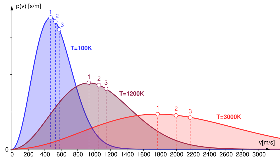
Maxwell–Boltzmann speed distributions for the same gas at several temperatures. As temperature increases, the peak moves to higher speeds while the distribution becomes broader and lower, with more probability in the high-speed tail. This directly visualizes why a hotter sample has a larger fraction of fast molecules even though most molecules are still near moderate speeds. Source
At a higher temperature:
the peak shifts to the right
the curve becomes lower
the curve becomes broader
more of the curve appears in the high-speed or high-energy region
These changes show that the atoms are spread over a wider range of speeds or energies.
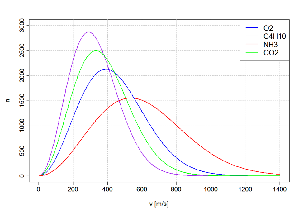
Maxwell–Boltzmann molecular speed distributions for several different gases at the same temperature (293.15 K). Lighter molecules peak at higher speeds and have broader distributions, while heavier molecules peak at lower speeds, highlighting the role of molecular mass at fixed temperature. This supports AP-style comparisons where both temperature and particle mass can affect the curve’s position and spread. Source
A higher-temperature sample has a greater fraction of atoms with large values, even though atoms are still distributed across many values.
At a lower temperature, the curve is taller, narrower, and concentrated more toward the left. If the number of atoms stays the same, the total area under the curve stays the same as well, because the graph still represents the same total sample.
Interpreting regions of the graph
A Maxwell-Boltzmann graph is often most useful when you compare areas in a chosen range. For example, you might look at the part of the curve beyond a particular speed. That region represents the fraction of atoms moving faster than that value.
This means graph questions are often about how many atoms lie in a range, not just about the location of the peak. A curve may have a lower peak but still include more atoms at very high speed if it stretches farther to the right.
The same idea applies to energy distributions. A region farther to the right corresponds to atoms with larger kinetic energies, even if only a small fraction of the sample occupies that part of the graph.
Common AP interpretations
In AP Physics 2 Algebra, you should be able to use a Maxwell-Boltzmann graph to decide which sample is hotter, which sample has more atoms above a chosen speed or energy, and what the peak and tail tell you about the sample.
Common mistakes include:
treating the height of the curve as the speed or energy itself
assuming the peak shows the speed of all atoms
thinking the tail represents impossible atoms rather than rare atoms
forgetting to check whether the horizontal axis is speed or energy
Always read the graph as a distribution of many atoms. The horizontal position tells you the speed or energy value. The vertical value tells you how common that value is. The full curve shows that a gas at one temperature contains atoms with a spread of speeds and kinetic energies, not a single shared value.
Speed graphs and energy graphs
A Maxwell-Boltzmann distribution can be plotted against speed or against kinetic energy.
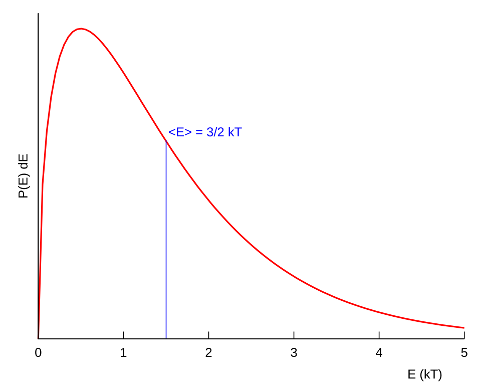
Kinetic-energy version of a Maxwell–Boltzmann distribution (a Boltzmann gas), plotted in scaled units of . The curve rises from zero to a single peak and then decays with a long right-hand tail, illustrating that high-energy particles are rare but possible. This complements speed-based graphs by reinforcing that the same distribution ideas apply when the horizontal axis is energy rather than speed. Source
Both versions communicate the same central idea: atoms in a gas sample are spread across a range of values at a given temperature.
The exact horizontal label matters. A speed distribution answers how atoms are spread over speeds. An energy distribution answers how atoms are spread over kinetic energies. The shapes are interpreted in the same general way: one peak, a broad spread, and a right-hand tail showing a small number of atoms with especially large values.
Practice Questions
Two Maxwell-Boltzmann speed distribution curves are drawn for the same gas and the same number of atoms. Curve B corresponds to a higher temperature than Curve A.
State two ways Curve B differs from Curve A. [2 marks]
Curve B is shifted to the right / corresponds to higher speeds being more common. (1)
Curve B has a lower peak and is broader, or it has a longer high-speed tail. (1)
A student says, "The peak of a Maxwell-Boltzmann energy distribution shows that nearly every atom has that same energy."
Evaluate this statement. In your answer:
explain what the peak represents
describe what the spread of the curve shows
explain the meaning of the high-energy tail
describe how the graph changes if the temperature increases while the number of atoms stays the same
[5 marks]
Peak gives the most probable energy, or the energy range containing the greatest number of atoms. (1)
Statement is incorrect because atoms are spread over a range of energies, not one single value. (1)
The spread shows different atoms have different energies at the same temperature. (1)
The high-energy tail shows a small but nonzero fraction of atoms with very large energies. (1)
At higher temperature, the curve shifts right and becomes lower and broader, with the same total area for the same number of atoms. (1)
FAQ
The speed axis starts at zero, so the distribution cannot extend equally to the left and right the way a symmetric bell curve would.
Collisions can still produce a small number of unusually fast atoms, so the graph develops a long tail on the high-speed side. That makes the curve skewed rather than symmetric.
The same temperature does not mean every type of atom has the same speed distribution. It means the gas samples are being compared at the same thermal condition.
For a lighter atom, a given kinetic energy corresponds to a larger speed than it does for a heavier atom. That is why lighter gases usually have speed distributions shifted farther to the right.
One common method is a time-of-flight measurement. A narrow pulse of atoms travels a known distance, and the arrival times are recorded.
earlier arrivals correspond to faster atoms
later arrivals correspond to slower atoms
collecting many arrivals builds the full distribution
Kinetic energy depends on speed through $K=\dfrac{1}{2}mv^2$, so equal changes in speed do not produce equal changes in energy.
When the horizontal axis is changed from speed to energy, the same physical sample is being described, but the spacing of values is remapped. The curve therefore changes shape even though the atoms are the same.
It works best for classical gases in thermal equilibrium. It becomes less accurate when those conditions are not met.
Examples include:
very low temperatures, where quantum statistics become important
extremely dense systems, where particle interactions matter more strongly
gases far from equilibrium, such as immediately after a sudden disturbance