

AP Syllabus focus: 'PV diagrams represent thermodynamic processes, and the work magnitude during expansion or compression equals the area under the curve.'
Pressure-volume diagrams turn a changing gas state into a visual map. They help you track expansion or compression and connect the geometry of a graph directly to the work involved in the process.
Pressure-volume diagram: A graph with pressure on the vertical axis and volume on the horizontal axis that shows the states of a gas and the process connecting those states.
What a PV Diagram Shows
A PV diagram represents how a gas changes from one state to another. Each point on the graph corresponds to a particular pressure and volume. A line or curve between two points represents a thermodynamic process.
This means a PV diagram does more than show numbers. It shows how the gas moves through different states as it expands, compresses, or changes pressure.
Reading the Axes
On a PV diagram:
moving to the right means the gas volume increases
moving to the left means the gas volume decreases
moving upward means the gas pressure increases
moving downward means the gas pressure decreases
The graph does not directly show time. A steep line is not automatically a fast process, and a shallow line is not automatically a slow one. What matters for work is the relationship between pressure and volume during the change.
Arrows may be added to show direction. This helps identify the initial state and final state, which is important when deciding whether the gas is expanding or being compressed.
Work and Volume Change
On a PV diagram, work is associated with a change in volume. If a gas pushes outward on a piston, the gas does work on its surroundings. If the surroundings push inward and reduce the gas volume, work is done on the gas.
A pressure change by itself is not enough to create PV work. There must also be a volume change. That is why a process at constant volume has zero work, even if the pressure changes a lot.
For a constant-pressure process, the work done by the gas is given by the product of pressure and change in volume.
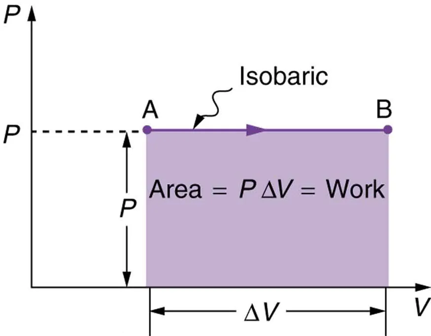
An isobaric (constant-pressure) process appears as a horizontal line on a – diagram. The shaded rectangle under the line has area , which equals the work done by the gas for that constant-pressure expansion or compression. Source
= work done by the gas during a constant-pressure process, in
= pressure, in
= change in volume, in
This equation also matches the geometry of the graph. For constant pressure, the area under the line is a rectangle, so the rectangle’s area gives the work.
If , the gas expands and the work done by the gas is positive. If , the gas is compressed and the work done by the gas is negative. Some problems ask for work done on the gas instead, which has the opposite sign. The syllabus statement focuses on magnitude, so the size of the area is the key idea.
Area Under the Curve
The central PV-diagram idea is that the work magnitude equals the area under the curve between the initial and final volumes.
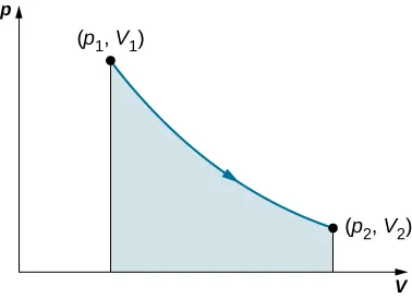
For a general quasi-static process, the work is found by the area under the curve between the initial and final volumes. The shaded region visualizes , emphasizing that the path shape (not the slope) determines the work magnitude. Source
This gives several useful interpretations:
larger pressure over the same volume change means a larger area and greater work magnitude
larger volume change at the same pressure also increases the area
no horizontal change means no area, so no PV work
If the pressure stays constant, the area is a rectangle. If the pressure changes continuously, the path may be curved, but the work magnitude is still determined by the area under that curve.
This is why PV diagrams are powerful: they turn a physical process into a geometric one.
Comparing Different Paths
Two different processes can start at the same state and end at the same state, yet involve different amounts of work. On a PV diagram, this happens because the paths enclose different areas.
For expansion:
the path that stays at higher pressure for more of the volume change gives a larger area
therefore, that path corresponds to greater work done by the gas
For compression:
the path with the larger area has the greater work magnitude
if using the sign convention for work done by the gas, the value is more negative
So, when comparing processes, do not focus only on the endpoints. The full path matters.
Common Shapes on PV Diagrams
Several graph shapes appear often:
horizontal line: constant pressure; work is easy to find from a rectangular area
vertical line: constant volume; work is zero because there is no change in volume
curved line: pressure varies with volume; work comes from the curved area beneath the path
A closed loop on a PV diagram represents a cycle.
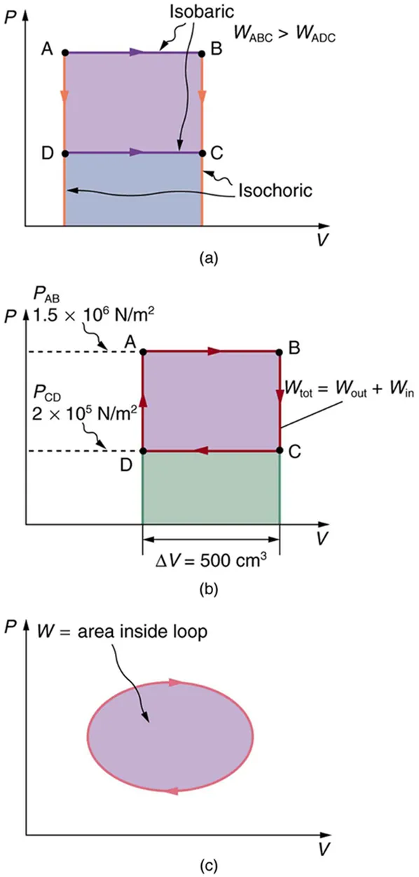
A closed loop on a – diagram represents a thermodynamic cycle, and the net work over the cycle equals the area enclosed by the loop. The arrows indicate direction, which determines the sign of the net work (clockwise typically corresponds to net work done by the gas). Source
In that case, the net work over the full cycle equals the area enclosed by the loop. Direction matters, because clockwise and counterclockwise loops correspond to opposite signs for the net work done by the gas.
Using PV Diagrams Effectively
When solving PV-diagram problems:
identify the initial and final states
determine whether the gas expands or compresses
check whether the question asks for work done by the gas, work done on the gas, or work magnitude
use the area under the process curve, not the slope of the curve
give the answer in correct units
The unit connection is important: is equivalent to . That is why the area of a PV graph represents energy transfer by work.
A common mistake is to look at the steepness of the line instead of the enclosed area. The slope tells how pressure changes with volume, but the area tells how much work is involved.
Practice Questions
A gas expands at a constant pressure of from a volume of to .
Calculate the magnitude of the work done by the gas. [2 marks]
Uses and finds (1)
Calculates (1)
A gas moves from state A to state B on a PV diagram.
State A: pressure , volume
State B: pressure , volume
Path 1: The gas first expands at constant pressure until the volume is , then the pressure decreases at constant volume to state B.
Path 2: The pressure first decreases at constant volume to , then the gas expands at constant pressure to state B.
(a) Determine the work done by the gas for each path.
(b) State which path gives the greater work magnitude and explain why using the PV diagram. [5 marks]
Recognizes that the constant-volume segment in each path does zero work (1)
Path 1: (1)
Path 2: (1)
Correctly states that Path 1 gives the greater work magnitude (1)
Explains that Path 1 has the larger area under the curve because the expansion happens at higher pressure over the same volume change (1)
FAQ
A PV diagram assumes the gas can be described by one pressure and one volume at each point along the path.
If the gas is changing extremely rapidly, different parts of the gas may have different pressures at the same time. Then a single point on a PV graph may not describe the whole system accurately.
In practice, PV diagrams are most meaningful for processes that are slow enough for the gas to stay close to equilibrium.
Yes, but the area will first come out in $L\cdot atm$, not joules.
To convert, use:
$1\ L\cdot atm \approx 101\ J$
If a problem only asks which process has greater work, conversion may not be necessary because the larger area stays larger in any consistent unit system.
If a numerical energy answer is required, convert to joules unless the problem says otherwise.
You can approximate the area under the curve using simple geometric methods.
Common approaches include:
splitting the area into rectangles or trapezoids
counting grid squares on the graph
using an average pressure over the interval if the curve is reasonably smooth
The goal is to estimate the area as accurately as the graph allows.
This is often enough for conceptual comparisons or approximate experimental results.
A crossing point means the gas has the same pressure and volume at two different moments in the overall process.
That is possible because pressure and volume alone do not always tell you everything about the history of the system. The gas may reach the same state after different intermediate changes.
When analyzing work, you must still follow the direction of each segment carefully. The work depends on the path taken through the graph, not just on where lines intersect.
Real data are affected by measurement uncertainty, sensor resolution, and small fluctuations in the system.
A jagged curve does not usually mean the physics is changing in a dramatic way. It often reflects:
noise in the pressure reading
limited data sampling
slight vibrations or uneven motion of the piston
In those cases, use the overall trend or a best-fit curve to estimate the area. The physically meaningful work is tied to the general shape of the process, not every tiny bump in the recorded line.