
AP Syllabus focus:
‘- Introduction to histograms as graphical representations of quantitative data.
- Detailing how the height of each histogram bar represents the number or proportion of observations within a specific interval.
- Discussing the impact of changing interval widths on the histogram's appearance and interpretative qualities.
- Skill 2.B: Mastering the creation and interpretation of histograms for representing quantitative data distributions.’
Histograms provide a powerful way to visualize quantitative data by grouping values into intervals and displaying their frequencies, allowing students to see patterns and distributional features clearly.
Understanding Histograms
A histogram is a graphical representation of the distribution of a quantitative variable, where data values are grouped into intervals known as bins. A bin represents a continuous range of values, and the height of its bar indicates how many observations fall within that interval. Because histograms display data as grouped frequencies, they offer insight into the shape, center, and variability of a distribution.
Histogram: A graphical display for quantitative data using adjacent bars to show the frequency or relative frequency of observations within specified intervals.
Histograms differ from bar charts because the variable displayed is numerical and continuous, which means the bars must touch to reflect the continuity of the scale. This continuity is essential because it reinforces how values transition smoothly from one interval to the next.
Constructing a Histogram
Creating a histogram requires organizing data into meaningful intervals and then plotting frequencies or relative frequencies.
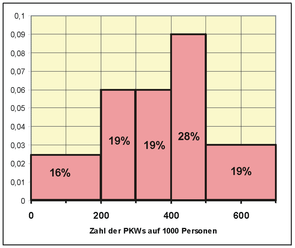
A standard histogram showing equal-width intervals and bar heights that represent frequencies, illustrating how quantitative data are grouped and displayed along a continuous numerical scale. Source.
Key Steps
Identify the variable being studied and confirm that it is quantitative.
Determine appropriate bin intervals, ensuring that each covers an equal width.
Count the number of observations within each interval to obtain frequencies.
Draw adjacent bars, each with a height proportional to its bin’s frequency or relative frequency.
Label axes, with the horizontal axis showing intervals and the vertical axis representing counts or proportions.
Choose scales that make the distribution’s structure easy to interpret.
The specification emphasizes the importance of understanding that bar height reflects the number or proportion of observations in each interval, meaning histograms can communicate either raw counts or relative frequencies. Both approaches depict distribution shape effectively, but relative frequency histograms allow easier comparison between samples of different sizes.
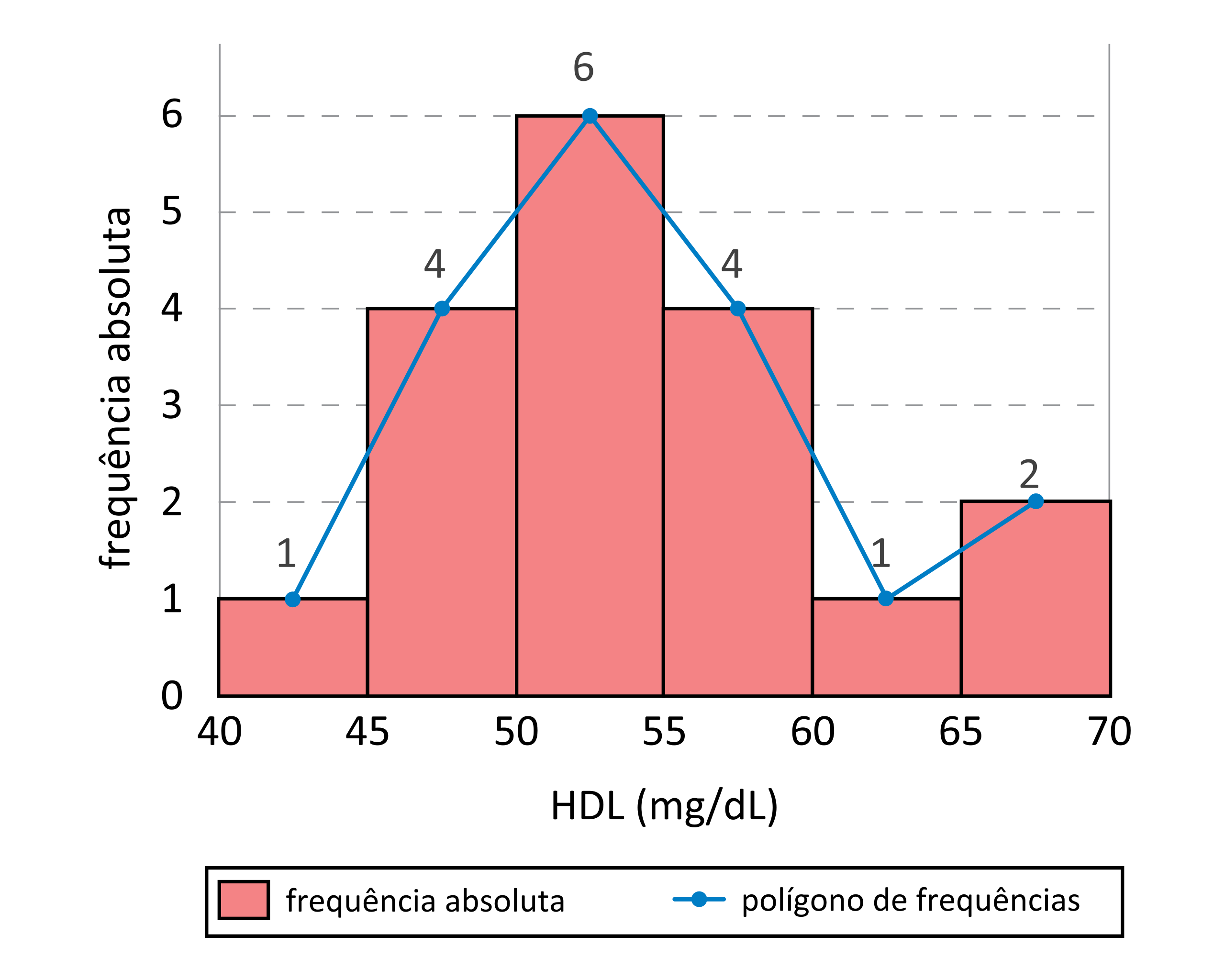
Histogram with equal-width intervals displayed as contiguous bars, accompanied by an additional frequency polygon line that traces the distribution’s pattern; the polygon extends beyond AP requirements but reinforces the concept of distribution shape. Source.
Interpreting Histograms
Once constructed, a histogram offers immediate visual cues about a dataset’s major features.
Features to Look For
Shape: A histogram can reveal whether a distribution is symmetric, skewed left or right, unimodal, bimodal, or roughly uniform.
Center: While not a precise measure, the region where most bars concentrate provides a sense of central tendency.
Variability: The spread of bars across the horizontal axis indicates how widely values differ.
Unusual features: Gaps, clusters, or exceptionally tall or short bars can signal meaningful patterns or irregularities within the data.
Interpreting these features supports Skill 2.B by helping students recognize and describe characteristics of quantitative distributions using a visual tool.
Understanding Bin Width and Its Impact
The width of each interval in a histogram significantly influences its appearance and interpretability. The specification highlights that changing interval widths alters visual impressions of the distribution.
Effects of Bin Width
Too narrow: A histogram with very small bins may appear noisy, with many bars of variable height obscuring overall structure.
Too wide: Excessively large bins may hide important features, such as clusters or multiple peaks.
Appropriate width: Balanced bin widths reveal major patterns while minimizing random fluctuation.
Choosing bin width often involves judgement. Technology tools commonly automate this process, but understanding the implications ensures students can critique or adjust interval choices when needed.
Using Frequency and Relative Frequency
Histograms may be constructed using either frequencies (counts) or relative frequencies (proportions). While both display comparable distribution shapes, relative frequency histograms allow comparisons between datasets with different sample sizes.
Relative Frequency: The proportion of observations in a category or interval, calculated as frequency divided by total sample size.
Understanding relative frequency is essential because it enables students to compare patterns across samples, recognizing similarities or differences in distribution shape even when counts differ.
Vertical Axis Interpretation
In a frequency histogram, the vertical axis shows the number of observations per interval. In a relative frequency histogram, the vertical axis represents proportions. When interpreting heights, students should connect these values directly to the concentration of data within each interval.
EQUATION
= Count of observations in an interval
= Sample size
A key instructional focus is understanding that bar height reflects density within an interval, not individual data values. This makes histograms ideal for visualizing overall distributional structure.
The Role of Histograms in Quantitative Data Analysis
Histograms serve as foundational tools for exploring quantitative variables because they visually summarize large datasets efficiently. Students use them to detect patterns, assess assumptions, and communicate distributional insights. By mastering histogram creation and interpretation, students fulfill the syllabus expectation of representing quantitative data graphically and understanding how key choices—such as bin width—shape analytical insights.
FAQ
Choosing the number of bins is a balance between clarity and detail. Too many bins produce a noisy distribution, while too few oversimplify it.
Several informal guidelines exist, such as aiming for bins that reveal major features without clutter. In practice, students often adjust bin numbers experimentally until the shape is interpretable.
Digital tools may offer default binning rules, but these are not always ideal, so manual refinement is encouraged.
Uncertainty can cause data points that should be similar to fall into neighbouring bins, making the histogram appear more irregular.
If uncertainty is large compared with the bin width, the shape may blur or show artificial variability.
A wider bin width can sometimes reduce noise, but it may also conceal meaningful structure.
Differences arise from choices made when constructing the histogram, such as:
Bin width
Bin boundaries
Whether frequency or relative frequency is used
Small changes in these parameters can highlight or conceal features such as clusters or asymmetry, even when the underlying measurements are similar.
Shifting all values moves the histogram horizontally without changing its overall shape.
Bins translate along the axis, but the height and relative pattern of the bars remain unchanged. Features such as skewness, clustering, and spread are preserved.
This demonstrates that histograms visualise distribution structure rather than absolute location.
By comparing the histogram’s shape with the expected distribution from theory, students can judge whether experimental results align with predictions.
For instance, a symmetric, mound-shaped histogram might support a model involving many small, independent contributions.
Large deviations, such as unexpected peaks or gaps, may signal experimental issues, systematic effects, or incomplete modelling.
Practice Questions
Question 1 (2 marks)
A physics class records the speeds of a set of toy cars moving along a smooth runway. The data are grouped into equal-width intervals, and a histogram is drawn.
Explain why a histogram, rather than a bar chart, is the appropriate graphical representation for these speed measurements.
Question 1 (2 marks)
1 mark: States that speed is a quantitative, continuous variable.
1 mark: Explains that histograms show frequencies across continuous intervals with touching bars, making them appropriate for continuous data (unlike bar charts).
Question 2 (5 marks)
A student constructs a histogram of the kinetic energies of identical steel balls released from different heights. The histogram uses equal-width energy intervals.
(a) State two features of the distribution that can be identified directly from the histogram.
(b) The student changes the interval width so that the bins become much wider. Explain how this change might affect the visibility of patterns in the data.
(c) Suggest why relative frequency might be used instead of frequency when comparing energy distributions from two separate experiments.
Question 2 (5 marks)
(a) Up to 2 marks:
1 mark: Identifies a feature such as the shape of the distribution (e.g. symmetric, skewed, modal behaviour).
1 mark: Identifies another feature such as spread/variability or presence of gaps/clusters/trends in frequencies.
(b) Up to 2 marks:
1 mark: States that wider intervals may hide important details, such as peaks, clusters, or variation.
1 mark: States that the distribution may appear smoother or oversimplified, potentially masking meaningful differences.
(c) 1 mark: Explains that relative frequency allows fair comparison between datasets of different sizes or total counts.
