
AP Syllabus focus:
‘Describing dotplots as graphical tools where each observation is represented by a dot placed over its value on a horizontal axis. Highlighting the utility of dotplots in displaying distributions for small to moderate-sized data sets, with the stacking of dots indicating frequency. Skill 2.B: Enhancing the ability to use dotplots for a straightforward visualization of quantitative data distributions.’
Dotplots offer a simple but powerful visual method for displaying quantitative data, helping students identify distributional features and interpret patterns quickly and accurately.
Understanding Dotplots
A dotplot is a graphical display in which each individual observation is represented by a dot positioned above its numerical value on a horizontal axis. Dotplots are especially useful for small to moderate-sized datasets, because they show every data value without grouping or aggregating information.
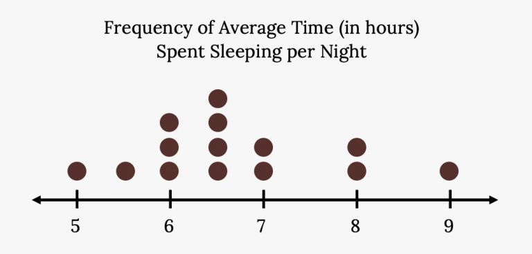
A dotplot showing nightly sleep duration for students, with each dot representing one student. Stacked dots indicate how many students share the same sleep value. This illustrates how dotplots display individual data points and their frequencies for small datasets. Source.
Dotplot: A graphical representation of quantitative data where each observation is shown as a dot above its value on a number line, with stacked dots indicating repeated values.
Dotplots provide an accessible way to see the distribution’s general shape, identify frequently occurring values, and detect any unusual data features. Their clarity makes them ideal for introductory analysis before using more complex graphical tools.
Why Dotplots Are Useful
Dotplots highlight important aspects of quantitative data that support meaningful statistical reasoning. Students benefit from their ability to display information precisely and compactly.
Key Advantages
Displays every data value without grouping, preserving detail.
Shows frequency through stacked dots, making repeated values clear.
Reveals patterns such as clusters, gaps, and potential outliers.
Supports comparison of observations within a single distribution.
Promotes intuitive interpretation, making them ideal for developing foundational data literacy.
Because dotplots emphasize the actual values themselves, they foster strong connections between raw data and distributional characteristics.
Constructing a Dotplot
Creating a dotplot requires accurate placement of observations so the visual display reflects the numerical data faithfully.
Steps for Creating a Dotplot
Draw a horizontal axis labeled with appropriate numerical values.
Mark each observed value along the axis at its correct location.
Place a dot directly above the axis for each observation.
Stack dots vertically when multiple observations share the same value.
Maintain consistent spacing to ensure readability and accurate interpretation.
When constructing dotplots, careful axis selection is essential. Too wide a scale disperses the data unnecessarily; too narrow a scale compresses the values, making patterns difficult to see.
Interpreting Dotplots
Dotplots support deep understanding of distributional features by illustrating patterns clearly. Interpreting a dotplot requires attention to several important characteristics.
Identifying Shape
A dotplot reveals whether a distribution is symmetric, skewed, unimodal, bimodal, or roughly uniform.
A single peak suggests a unimodal distribution.
Two peaks indicate bimodality.
A longer tail on either side suggests skewness.
These features guide students toward understanding the underlying behavior of the data.
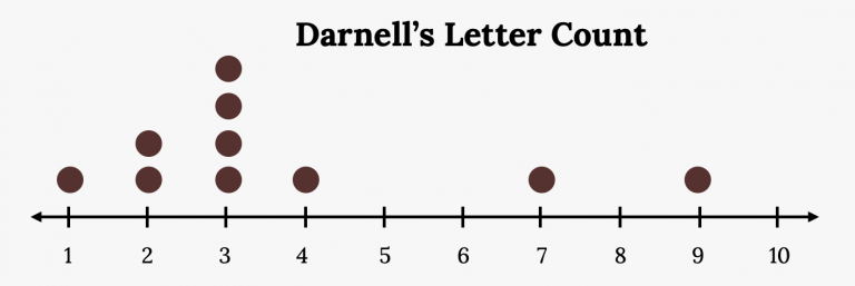
A dotplot of Darnell’s letter counts, with each “x” showing one observation and stacked x’s showing repeated values. The right-skewed shape demonstrates how dotplots reveal a distribution’s form. The source also discusses center measures, which is additional context beyond this subsubtopic. Source.
Recognizing Clusters and Gaps
Dotplots make clusters—groups of observations concentrated in a region—visually prominent. Gaps, locations with no observations, may suggest separate subgroups or noteworthy variation.
These features help students consider what may be influencing the data, solidifying the role of context in statistical reasoning.
Detecting Outliers
Unusual or extreme values appear as isolated dots far from the body of the distribution. While dotplots do not provide a formal rule for identifying outliers, they make outlier candidates visually obvious, helping students consider their potential impact on further analysis.
Dotplots and Data Context
AP Statistics emphasizes interpreting data within context, and dotplots directly support this skill. Because every observation is represented explicitly, students can connect meaningful real-world differences to visible distribution patterns.
For example, dotplots make it easier to discuss which values occur most often, whether a dataset tends to be concentrated or spread out, or whether unusual values might require explanation. The clear link between data and visual representation strengthens the student's ability to form justified claims.
Using Dotplots in Statistical Reasoning
Dotplots align closely with Skill 2.B, which focuses on the construction and interpretation of graphical displays of quantitative data. Students are expected to use dotplots to:
Identify overall patterns, such as typical values or common ranges.
Describe variability, noting whether values are tightly grouped or widely spread.
Evaluate comparative tendencies, especially when working with multiple dotplots.
Support evidence-based statements, grounded in observed features of the graph.
These capabilities build a foundation for more advanced analysis using histograms, boxplots, and numerical summaries.
Choosing Dotplots Appropriately
Dotplots are most effective when the dataset is small to moderate in size. When datasets become large, the display can become cluttered and difficult to interpret. For introductory analysis within this size range, dotplots remain one of the clearest options available.
Because they retain all individual values, dotplots are particularly suited for initial exploratory analysis, where detail and transparency are vital.
FAQ
Dotplots show every data value precisely, whereas tally charts summarise values into counts. This makes dotplots more useful for spotting subtle distributional patterns.
Dotplots also show frequency through stacking rather than tally groupings, making repeated values visually clearer.
Tally charts are quicker for manual counting, but dotplots provide a more intuitive visual interpretation of shape, clusters, and potential outliers.
Dotplots allow small peaks in frequency to stand out because each dot represents an individual observation. Even a slight increase in stacked dots signals a potential mode.
In contrast, grouped displays like histograms can hide minor peaks if bin widths are too wide. Dotplots allow you to see fine structure in the data before binning decisions influence interpretation.
A suitable scale ensures that data values are evenly spaced and easy to distinguish. Too narrow a scale compresses the dots, making patterns harder to see; too wide a scale spreads them unnecessarily.
Consider:
The range of the data
The precision of the measurements
Space needed to show stacked frequencies clearly
A thoughtful scale helps maintain readability and prevents misinterpretation.
Dotplots allow side-by-side visual comparison of spread by aligning two horizontal axes at the same scale. This makes differences in clustering, range, and general dispersion clear.
Greater vertical stacking in one plot suggests repeated values, while wider horizontal spread indicates greater variability. This visual approach avoids relying solely on numerical summaries.
When a dataset includes numerous identical observations, stacking dots can produce very tall columns. This can make the display visually unbalanced and harder to interpret.
In such cases, alternatives like histograms or boxplots may present the distribution more effectively because they summarise repeated values without creating excessive vertical stacking.
However, for most small to moderate datasets, dotplots remain one of the clearest and most informative representations.
Practice Questions
Question 1 (2 marks)
A small dataset is displayed using a dotplot. Explain why a dotplot is an appropriate choice for representing this dataset.
Question 1 (2 marks)
1 mark: States that dotplots show each individual data value clearly.
1 mark: States that dotplots are suitable for small to moderate datasets because they illustrate frequency through stacked dots.
Question 2 (5 marks)
A researcher records the reaction times (in seconds) of 20 participants and displays the data in a dotplot.
(a) Describe how the dotplot allows the researcher to identify any clusters or gaps in the data.
(b) Explain how the dotplot can be used to comment on the overall shape of the distribution and suggest what this might imply about participant reaction times.
Question 2 (5 marks)
(a)
1 mark: Identifies that clusters appear where many dots are grouped closely together.
1 mark: Identifies that gaps appear where there are no dots along the axis.
1 mark: Explains that this visual pattern helps highlight regions of frequent and infrequent reaction times.
(b)
1 mark: Describes how the dotplot shows the shape (e.g., symmetry, skewness, peaks).
1 mark: Explains how the observed shape can indicate whether most reaction times are similar, whether there are outliers, or whether some participants responded much faster or slower than others.
