
AP Syllabus focus:
‘Defining cumulative graphs and their purpose in showing the cumulative count or proportion of observations up to a certain value.
- Skill 2.B: Developing skills in creating and interpreting cumulative graphs to summarize quantitative data distributions effectively.’
Cumulative graphs provide an essential way to visualize how counts or proportions build progressively across the values of a quantitative variable, helping reveal distribution structure and patterns that may not be immediately apparent in non-cumulative displays.
Understanding Cumulative Graphs
A cumulative graph is a graphical representation that displays the running total of observations up to each value or interval of a quantitative variable. Its primary purpose is to illustrate how the accumulation of data increases across the dataset, offering insight into how quickly or slowly observations accumulate in different regions. Cumulative graphs are particularly useful because they convert raw distributions into a progressively increasing pattern, making comparisons clearer and shapes easier to interpret.
Cumulative Graph: A graph that displays the cumulative count or cumulative proportion of observations up to each value or class boundary in a quantitative distribution.
Cumulative graphs always rise from left to right because they accumulate observations rather than showing individual frequencies.
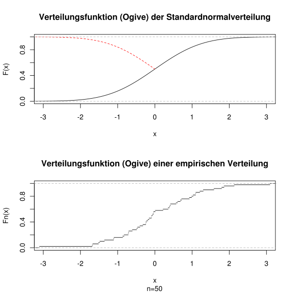
This figure shows an ogive: cumulative distribution curves for a theoretical model and for empirical sample data plotted on shared axes. The vertical axis represents the cumulative proportion of observations up to each horizontal value, illustrating how totals build across the distribution. The presence of both theoretical and empirical curves slightly exceeds the syllabus needs but reinforces that cumulative graphs display accumulation across values. Source.
Types of Cumulative Displays
The two most common cumulative representations encountered in introductory statistics are cumulative frequency graphs and cumulative relative frequency graphs. Both rely on ordered data and both emphasize the incremental build-up of information across values. While the format may differ, their conceptual structure is consistent.
Cumulative Frequency Graphs
A cumulative frequency graph displays the cumulative count of observations up to successive data values or class boundaries. Because it tracks the number of observations collected so far, it provides an intuitive depiction of how data accumulate across the measured variable.
Students often examine these graphs to identify where the count increases slowly or rapidly, locate points marking specific cumulative totals, and assess general tendencies in the data distribution. Because these graphs emphasize total counts, they are particularly helpful when studying distributions with varying density across intervals.
Cumulative Relative Frequency Graphs
A cumulative relative frequency graph instead displays the cumulative proportion, showing how the percentage of observations increases as values progress. This representation is especially valuable when comparing different datasets, because proportions standardize the scale across groups of varying sizes.
Cumulative Relative Frequency: The proportion of observations that fall at or below a given value, found by dividing the cumulative frequency by the total number of observations.
By expressing accumulation as a proportion rather than a raw count, cumulative relative frequency graphs make interpretation more accessible across contexts and highlight key percentiles in a distribution.
Constructing Cumulative Graphs
Constructing a cumulative graph requires careful attention to ordering, accumulation, and labeling.
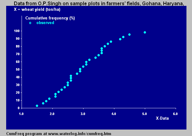
This graph illustrates a cumulative frequency curve, with each point marking the total number of observations at or below a specific value. Its upward progression reinforces that cumulative graphs add counts as the variable increases. The dataset and numerical scale extend slightly beyond the syllabus but serve as a clear model of the construction process. Source.
Steps for Construction
Order the data from smallest to largest to ensure cumulative values progress appropriately.
Create a frequency table or grouped table, listing values or intervals alongside their frequencies.
Add a cumulative column representing either cumulative frequency or cumulative relative frequency.
Plot points at each value or class boundary, pairing the value with its cumulative total.
Connect the plotted points with smooth lines or segments for a cumulative frequency curve, or leave as discrete markers depending on the desired format.
Label axes clearly, with the quantitative variable on the horizontal axis and the cumulative count or cumulative proportion on the vertical axis.
A cumulative graph should always reflect a clear, upward-moving pattern, signaling the continual addition of observations and enabling students to identify distribution features such as percentiles, medians, or concentration of values.
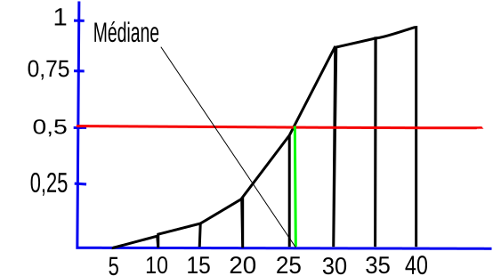
This cumulative frequency curve demonstrates how total frequency increases across ordered values and shows how a median can be located at the 50% cumulative level. Its steady upward shape reinforces the concept that cumulative graphs present “up to this value” information. The explicit marking of the median exceeds the syllabus slightly but illustrates a widely used application. Source.
Interpreting Cumulative Graphs
Interpretation focuses on what the cumulative structure reveals about how observations are distributed. Because the graph rises steeply where values are densely concentrated and flattens where observations are sparse, students can infer important characteristics of the distribution.
Key Interpretive Features
Steeper segments indicate intervals where many observations occur.
Flatter segments indicate fewer observations in those intervals.
Percentile values can be located by tracing horizontal lines from cumulative proportions to the graph and then down to the data scale.
Comparing multiple graphs allows students to assess differences in accumulation patterns across datasets.
Understanding how cumulative graphs encode information about the distribution helps students meet Skill 2.B, which emphasizes constructing and interpreting graphical summaries of quantitative data. This skill supports accurate and context-driven reasoning in statistical analysis.
Cumulative Graphs in Context
Cumulative graphs provide a strategic advantage in settings where identifying thresholds, comparing distribution tails, or locating percentile-based benchmarks is required. Their structure aligns directly with questions asking how much of the data lies below a particular value. Because the cumulative format inherently ties each point to an “up to this value” interpretation, students gain a powerful tool for describing distributional behavior in a clear and methodical manner.
They also support broader communication of statistical findings, allowing an audience to visualize cumulative growth patterns, understand distribution tendencies, and identify structural features such as rapid accumulation regions or sparse tails. Within the AP Statistics framework, mastering cumulative graphs ensures that students can effectively summarize and interpret quantitative distributions using robust, visually driven methods that directly reflect the underlying syllabus goals.
FAQ
A cumulative graph displays how the total number or proportion of observations builds up across increasing values, while a standard distribution graph shows frequencies at each individual value or interval.
Because cumulative graphs emphasise accumulation, they are especially helpful for identifying percentiles, medians, and thresholds that are harder to pinpoint from ordinary frequency distributions.
Cumulative graphs involve adding values progressively, which dampens the effect of irregularities in individual frequency counts.
Small fluctuations that would create noticeable spikes or dips in a frequency graph become absorbed into the steady accumulation, making cumulative curves smoother and easier to interpret visually.
A cumulative graph is more useful when you need to determine:
• The proportion of observations below a specific value
• How quickly or slowly observations accumulate across the range
• Key percentile markers such as the median or quartiles
It provides clearer insight into thresholds or limits, which are not immediately visible on histograms.
Yes, but indirectly. A cumulative graph will not show individual outliers, but it may reveal unusual patterns in the way totals build.
For example, a sudden, isolated increase after a long flat region may suggest an extreme value, prompting further inspection of the raw data.
Wider intervals lead to larger jumps at each step and can make the curve appear less detailed, smoothing over finer features in the distribution.
Narrower intervals produce a more detailed and gradual curve, allowing more precise interpretation of where observations accumulate most rapidly.
Practice Questions
Question 1 (2 marks)
A student plots a cumulative frequency graph for the speeds of moving vehicles. Explain why the curve must rise as the speed value increases.
Question 1
• Curve rises because cumulative frequency is a running total that cannot decrease (1)
• Each additional data point adds to or maintains the cumulative value as the variable increases (1)
Question 2 (5 marks)
A set of measurements of droplet diameters is used to construct a cumulative relative frequency graph.
(a) Describe how the student should process the raw data to produce the cumulative relative frequency values.
(b) The resulting graph shows very steep increases between certain diameter ranges and almost flat sections between others. Explain what these features indicate about the distribution of droplet sizes and how they help the student interpret the dataset.
Question 2
(a)
• Sort or order the raw droplet diameter data from smallest to largest (1)
• Create frequency counts for each diameter or interval (1)
• Add frequencies cumulatively to form cumulative frequency (1)
• Divide each cumulative frequency by the total number of observations to form cumulative relative frequency (1)
(b)
• Steep sections indicate many droplets within that diameter range (1)
• Flat or shallow sections indicate few or no droplets within those ranges (1)
• These features reveal concentrations, gaps or patterns in the distribution and help identify where most of the droplets’ sizes lie (1)
