
AP Syllabus focus:
‘Investigating various other methods for graphically representing distributions of quantitative data.
- Encouraging exploration and application of diverse graphical techniques to provide comprehensive insights into the data's characteristics.
- Skill 2.B: Fostering adaptability in choosing and applying the most appropriate graphical representation methods for different types of quantitative data.’
Exploring Additional Graphical Representations
Introductory graphical tools provide valuable insight into quantitative data, yet many datasets benefit from alternative displays that highlight structure, patterns, and distributional characteristics in flexible ways.
Expanding Beyond Standard Graphs
A central goal of this subsubtopic is to understand diverse graphical techniques that deepen interpretation of quantitative variables. These tools complement more traditional plots by revealing distributional features that might not appear clearly through a single display. They support Skill 2.B, which emphasizes proficiency in selecting and applying appropriate methods for data visualization.
Ogives (Cumulative Frequency Graphs)
An ogive provides a cumulative visual summary of how observations accumulate across ordered values. This graph helps identify medians, quartiles, and the overall rate at which data accumulate across the scale. Because an ogive displays cumulative proportions, it offers a smooth perspective on the shape of a distribution and highlights transitions that might be less apparent in histograms or dotplots.
Ogive: A graphical display showing cumulative frequencies or cumulative relative frequencies across ordered intervals of a quantitative variable.
Ogives are especially helpful when examining how quickly or slowly data accumulate in certain ranges, supporting comparison of segments of the distribution.
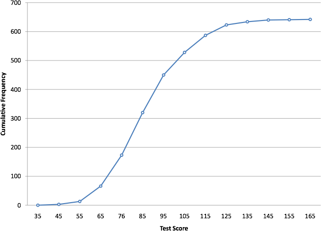
This cumulative frequency polygon (ogive) shows how cumulative counts increase across score intervals, helping reveal medians, percentiles, and distributional accumulation patterns. Source.
Frequency Polygons
A frequency polygon is a connected-line representation of frequency counts or relative frequencies. Unlike histograms, which use bars, frequency polygons connect midpoints of class intervals to form a continuous line, making overall shape trends more visible.
Frequency Polygon: A graph created by plotting class midpoints against their frequencies and connecting the points with straight line segments.
This display is effective for identifying changes in distribution shape, allowing students to compare patterns across multiple datasets plotted on the same axes.
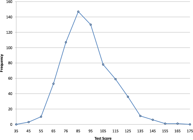
This frequency polygon displays class midpoint frequencies connected by straight segments, revealing the overall shape and skewness of the test-score distribution. Source.
Cumulative Relative Frequency Plots
A cumulative relative frequency plot extends the idea of cumulative graphs by emphasizing proportional accumulation of data. While similar to ogives, these plots focus exclusively on cumulative proportions rather than raw counts, making them particularly useful when comparing distributions from different-sized samples.
These plots visually encode the proportion of the dataset below any given value, offering a clear view of medians, percentiles, and skewness.
Kernel Density Curves
A kernel density curve provides a smooth approximation of the underlying distribution. It replaces the blocky appearance of histograms with a continuous curve that adjusts to local concentrations of data. This technique helps visualize subtle structural features, such as gentle skewness or multimodality.
Kernel Density Curve: A smoothed curve estimating the probability distribution of a quantitative variable by averaging nearby data points with a weighting function (kernel).
Because density curves are flexible and responsive to underlying data patterns, they can reveal multi-peaked structures or suggest the presence of clusters.
When These Methods Are Most Useful
Students should consider these additional graphical displays when traditional graphs fail to show needed detail or when the data require more nuanced interpretation. These methods help identify:
Subtle modes that may be hidden in histograms with wide intervals
Gradual trends across cumulative displays
Comparisons between distributions with different sample sizes
Smoother approximations to underlying population behavior
Each tool enhances the ability to choose the most appropriate representation depending on the dataset's characteristics, supporting the syllabus emphasis on adaptability.
Layered Insights Through Multiple Representations
Using multiple graphical methods together can deepen analysis. For instance:
A histogram may show the basic distribution,
A frequency polygon may highlight overall shape transitions, and
A kernel density curve may reveal hidden structure.
This layered approach strengthens interpretation by presenting various perspectives on the same quantitative variable.
Reinforcing the Role of Context
Choosing an appropriate graphical representation must be grounded in the context of the data. Because different techniques highlight different aspects of a distribution, students must match the tool to the analytical goal, whether identifying the center, analyzing variability, spotting clusters, or exploring distributional smoothness.
Adaptability as a Key Skill
The ability to move beyond standard graphs and apply diverse displays reflects a deeper understanding of quantitative data behavior. Mastery of these additional methods supports students in developing flexible, context-sensitive approaches to representing distributions while meeting expectations of Skill 2.B emphasized in the specification.
FAQ
The smoothness depends mainly on the bandwidth, which controls how widely each data point is spread when forming the curve.
A larger bandwidth produces a smoother curve but can hide subtle features.
A smaller bandwidth preserves detail but can introduce artificial bumps.
Other influences include sample size and the choice of kernel function, though the latter typically has a minor effect compared with bandwidth.
The rate of increase reveals how data accumulate across the scale.
If the curve rises steeply early on, more values lie at the lower end, suggesting left skew.
If it rises slowly at first and more steeply later, this indicates right skew.
Because the curve never descends, skewness is inferred from changes in gradient rather than symmetry.
A frequency polygon relies on grouped data, so it is unsuitable when sample sizes are very small or when data are better represented as individual values.
It is also inappropriate if class intervals are irregular or poorly defined, as the connected lines would misrepresent the distribution.
For heavily multimodal data, the polygon may oversimplify the structure by smoothing over narrow peaks.
Different graphs respond differently to grouping decisions.
Comparing a histogram or polygon with a kernel density curve helps determine whether a peak or dip is real or produced by interval choices.
Cumulative graphs such as ogives further confirm patterns by showing whether sudden increases in frequency occur at consistent points across representations.
Overlaying graphs allows immediate visual comparison of features such as peaks, spread, and accumulation.
Precautions include:
Ensuring the same scale and axis limits for all displays
Avoiding clutter by limiting the number of overlaid graphs
Using distinguishable line styles or colours
This approach is especially useful when checking whether different smoothing or grouping choices lead to consistent conclusions.
Practice Questions
Question 1 (2 marks)
A student creates a frequency polygon to represent a set of measurements. Explain why a frequency polygon may be preferred over a histogram when analysing the overall shape of a distribution.
Question 1 (2 marks)
1 mark: States that a frequency polygon allows easier identification of the overall shape or trend of the distribution (e.g., peaks, skewness).
1 mark: Notes that it provides a clearer comparison between multiple datasets when plotted on the same axes or that it avoids the blocky appearance of a histogram.
Question 2 (5 marks)
A researcher records the times taken for a sensor to respond in 200 separate trials. They construct several graphical representations of the data, including an ogive, a frequency polygon, and a kernel density curve.
(a) Describe what information the ogive provides that the other graphs do not.
(b) Explain how the frequency polygon helps identify the underlying shape of the distribution.
(c) Discuss one advantage of using a kernel density curve when examining the data’s structure.
Question 2 (5 marks)
(a)
1 mark: Mentions that an ogive shows cumulative frequency or cumulative proportion.
1 mark: States that it allows determination of medians, quartiles, and percentiles directly.
(b)
1 mark: States that the frequency polygon highlights the distribution's general shape (e.g., symmetry, skewness, modality).
1 mark: Explains that connecting class midpoints gives a smooth visual indication of increases and decreases across intervals.
(c)
1 mark: States an advantage such as showing a smooth estimate of the distribution, revealing clusters or multiple peaks, or avoiding the artificial grouping imposed by class intervals.
