
AP Syllabus focus: 'A gap is a region with no observed data, while clusters are concentrations of data usually separated by gaps.'
When describing a quantitative distribution, noticing where data values do not appear can be just as important as noticing where they gather. Gaps and clusters help reveal meaningful structure in data.
Understanding the Terms
A gap is one of the clearest signs that a distribution is not smoothly spread across all values.
Gap: A region of a quantitative distribution in which no observations occur.
A gap can be narrow or wide, but it must represent an interval with no observed data values. In a graph, this may look like an empty stretch on the horizontal axis between occupied regions.
A cluster describes a part of the distribution where many observations are grouped together.
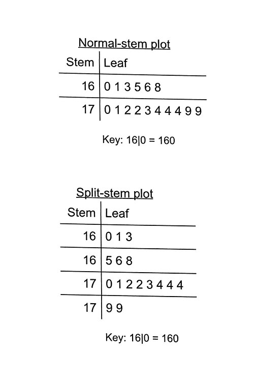
Side-by-side stem-and-leaf plot layouts illustrating how numeric data can form concentrated regions (clusters) and potentially show missing stems that function as gaps. Because the stems define the measurement scale, whether a “missing” region is meaningful depends on how the stems are constructed and grouped. Source
Cluster: A concentration of observations in a relatively narrow region of a distribution, often separated from other concentrations by gaps.
A data set may have one clear cluster, several clusters, or no distinct clusters at all. These features are always judged relative to the scale of the graph and the amount of data shown.
Why Gaps and Clusters Matter
Gaps and clusters are important because they show that data are not always spread evenly. They can reveal structure that would be missed by looking only at a single number such as a center.
When you identify a gap or cluster, you are noticing something about how the values are distributed:
A cluster shows where values are concentrated.
A gap shows where values are absent.
Together, they can suggest that the data may have separate groupings rather than one continuous pattern.
These features can be especially useful when describing a distribution in context. For example, a cluster may indicate a common range of values, while a gap may suggest a separation between different kinds of individuals or outcomes.
However, gaps and clusters are descriptive features. They help you describe what the graph shows, but they do not automatically explain why the pattern happened.
How to Identify a Gap or Cluster
Look for empty regions and concentrations
To identify a gap, scan the graph for a stretch of the variable where no observations appear. To identify a cluster, look for a section where observations are noticeably packed together.
You may see these features in:
Dotplots, where dots bunch together or leave an empty interval
Stem-and-leaf plots, where consecutive stems or leaves may be missing
Histograms, where bars appear in groups with empty intervals between them
The key idea is that a cluster is a concentration, while a gap is an absence.
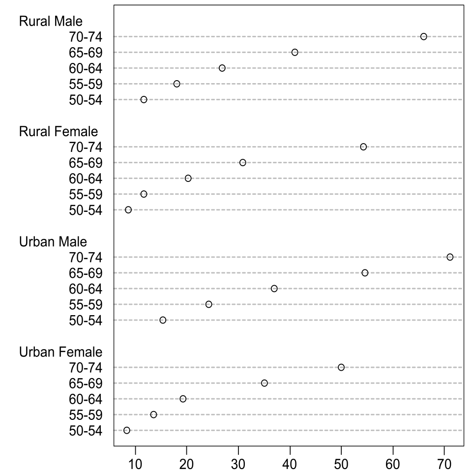
Cleveland-style dot plot with values placed on a shared numeric scale, making regions of higher point density easy to spot as clusters. Sparse stretches along the scale function as visual “gaps,” emphasizing that these features are about where observations are present versus absent. Source
Use the graph’s scale carefully
A feature counts as a gap or cluster only in relation to the scale shown. A very small empty space may not be meaningful if the axis uses fine measurement units. Likewise, a cluster should stand out as a real concentration, not just a few nearby points in a scattered display.
Ask yourself:
Is the empty region large enough to notice relative to the rest of the graph?
Is the concentration clearly denser than nearby regions?
Would another reasonable viewer likely describe the same feature?
There is no fixed numerical rule for deciding whether a gap or cluster is present. Statistical description here depends on careful visual judgment.
Interpreting Gaps and Clusters in Context
A gap or cluster becomes statistically useful only when it is described using the variable and context of the data.
A strong description should include:
where the feature occurs
what the feature is
how it relates to the overall distribution
For instance, instead of saying “there is a gap,” a better description would identify the approximate interval where no observations appear. Instead of saying “the data are clustered,” a better description would state the range where values are concentrated.
Context matters because the same-looking graph can mean different things in different settings. A gap might reflect:
a natural separation in behavior or outcomes
a restriction in how values occur
different subgroups within the data
chance variation in a smaller sample
A cluster might reflect:
a common typical range
repeated similar outcomes
one subgroup within a larger data set
Still, you should avoid claiming a specific cause unless the context clearly supports it. A graph can suggest patterns, but it does not by itself prove an explanation.
Describing These Features Well
Good statistical language
When writing about gaps and clusters, use precise and cautious wording. Good descriptions often include words such as:
appears
seems
roughly
approximately
concentrated
separated
This helps you describe the visible pattern without overstating what the graph proves.
A strong description usually does the following:
names the feature correctly
gives an approximate interval
connects the feature to the variable in context
If a distribution has more than one cluster, say so directly. If there are no clear gaps or clusters, it is also appropriate to state that the distribution shows no obvious gaps or no distinct clusters.
What not to do
Common mistakes include:
calling a low-frequency region a gap even though some observations are present
treating one isolated point as a cluster
ignoring the graph’s scale
assuming that a gap always means missing data
assuming that clusters prove the existence of different populations
A gap requires no observations in that region. A cluster requires a noticeable concentration, not just a random small bunch of points.
Using Gaps and Clusters as Part of Distribution Description
Gaps and clusters are usually described alongside other visible features of a distribution, but they should be identified on their own terms. Their main value is that they help you see whether the data form one connected pattern or several separated groupings.
When you examine a quantitative graph, pay attention not only to where values are common, but also to where they are absent. That contrast is exactly what makes gaps and clusters such useful descriptive tools.
Practice Questions
A dotplot of the number of hours students study each week shows many observations from 2 to 6 hours and many observations from 9 to 12 hours, with no observations from 7 to 8 hours. Describe one gap and one cluster in the distribution.
1 mark: Correctly identifies the gap as the interval from 7 to 8 hours with no observations.
1 mark: Correctly identifies at least one cluster, such as the concentration from 2 to 6 hours or from 9 to 12 hours.
A histogram displays the ages of participants in a recreation program. Most observations are between 8 and 12 years, a smaller group is between 16 and 18 years, and there are no observations between 13 and 15 years.
(a) Describe the clusters and gap in the distribution.
(b) Explain why the graph suggests that the distribution may include separate groupings.
(c) State one reason why a student should be cautious about giving a cause for the gap.
2 marks: Part (a)
1 mark for identifying a cluster around 8 to 12 years.
1 mark for identifying a second cluster around 16 to 18 years and the gap from 13 to 15 years.
2 marks: Part (b)
1 mark for stating that the data are concentrated in two different regions.
1 mark for explaining that the empty interval between them suggests separated groupings rather than one continuous concentration.
1 mark: Part (c)
States a valid caution, such as the graph alone does not prove a cause, the pattern could be due to sampling variation, or more contextual information is needed.
FAQ
There is no universal cutoff.
A region is more convincing as a gap when:
it is clearly visible on the graph’s scale
nearby values are present on both sides
the empty stretch is not just a single missing tick mark
The larger the sample, the easier it is to treat a gap as meaningful. In very small samples, an empty interval may happen just by chance.
Yes. Clusters do not require a completely empty space between them.
Sometimes the graph shows:
a heavy concentration of values
then a thinner region
then another heavy concentration
In that case, you may describe the data as having possible or moderate clustering. A perfect gap makes the pattern clearer, but it is not required for clustering to exist.
Yes. Rounding can pile values onto a few repeated numbers.
For example, if measurements are recorded only to the nearest whole number, nearby true values may be compressed into the same displayed value. That can make a concentration look sharper than it actually is.
If you suspect this, check:
the measurement precision
whether values were grouped before graphing
whether the raw data are available
Usually, no. A gap is typically an empty region between observed parts of the distribution.
If no values appear beyond the largest or smallest observation, that is just the end of the data, not a gap. A gap is most useful when it separates occupied regions and helps show that the data are split into distinct parts.
Treat the pattern cautiously and examine the raw data if possible.
Different displays can change how obvious clusters seem because of:
bin choices
axis scale
how individual observations are stacked or grouped
If the pattern is strong, it should appear in more than one reasonable display. If it disappears when the graph changes slightly, it may be too weak to describe confidently as a real cluster.
