

Edexcel Syllabus focus:
'Analyse and interpret quantitative illness and mortality data to determine health risks, distinguishing correlation from causation and recognising conflicting evidence.'
Illness and mortality data help biologists judge health risk in populations. Accurate interpretation depends on comparing numbers fairly, spotting meaningful patterns, and avoiding the mistake of treating every association as proof.
What illness and mortality data show
Illness data describe how often disease occurs or how many people are living with it, while mortality data describe deaths caused by disease. In this topic, the emphasis is on quantitative data, meaning numerical evidence such as counts, rates, and percentages. These data can help identify which groups appear to have a higher health risk.
A major principle is that raw totals are often misleading.
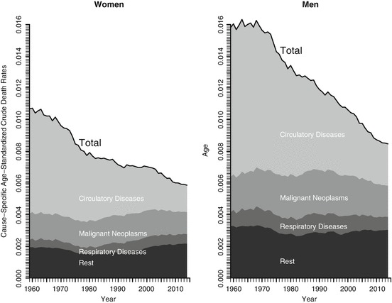
Age-standardised death rates are plotted over time, allowing fairer comparisons because they remove (as far as possible) changes due only to different age structures. The two panels separate women and men and show how trends in cause-specific mortality can rise or fall independently of population size. This is the kind of quantitative pattern that is informative for health risk only when the comparison is standardised appropriately. Source
A larger population will usually have more cases and more deaths simply because more people live there. For this reason, biologists often compare rates or percentages rather than total numbers.
When interpreting illness or mortality data, check that the comparison is fair:
the same disease is being measured in each group
the same time period is being used
the same units are being compared
the populations are similar enough for comparison to be meaningful
any major differences, such as age structure, are taken into account
If one population is much older than another, it may naturally show more disease and higher mortality. That does not automatically mean the underlying health risk factor is stronger.
How to interpret quantitative patterns
A single number rarely gives a reliable answer. The key is to look for patterns across datasets, groups, or time. If illness or mortality is consistently higher in one group, that may suggest increased risk. However, patterns must be interpreted carefully.
Useful questions to ask include:
Is the difference large enough to matter biologically?
Is the same trend seen in more than one dataset?
Does the trend continue over time, or is it only a short-term fluctuation?
Are you comparing rates, not just totals?
Could another factor explain the pattern?
It is also important to distinguish between absolute and relative change. A dramatic percentage increase may sound serious, but if the starting number was very small, the real increase in risk may still be small. This is why headlines based only on percentages can be misleading.
When data vary from year to year, not every rise or fall represents a real biological effect. Some variation may be due to chance, recording differences, or temporary changes in diagnosis and reporting. A longer-term trend is usually more informative than a single point.
Correlation and causation
When two variables appear linked, this is called a correlation.
Correlation: A relationship in which two variables change together, either in the same direction or in opposite directions.
For example, a population with higher exposure to a possible risk factor may also show higher mortality from a disease. This may be important, but it is not enough on its own to prove cause.
A causal relationship means one factor directly contributes to producing another outcome.
Causation: A relationship in which one factor directly produces or helps produce a change in another factor.
The distinction matters because correlation does not prove causation. Two variables may be linked for several reasons:
the relationship may be coincidental
a third variable may affect both
the apparent link may come from differences between the groups being compared
For example, if a group with high mortality also has a certain lifestyle feature, that feature may not be the true cause. Another hidden factor may be responsible. This is why interpreting health risk requires caution.
Evidence for causation becomes stronger when:
similar findings appear in multiple independent datasets
the association is consistent
there is a sensible biological explanation
changes in exposure are followed by changes in illness or mortality
Even then, one graph or one dataset is rarely enough to prove a causal claim by itself. In biology, strong conclusions usually depend on the overall body of evidence.
Recognizing conflicting evidence
Health data often do not all point in exactly the same direction. Conflicting evidence means that different datasets or studies appear to give different conclusions.
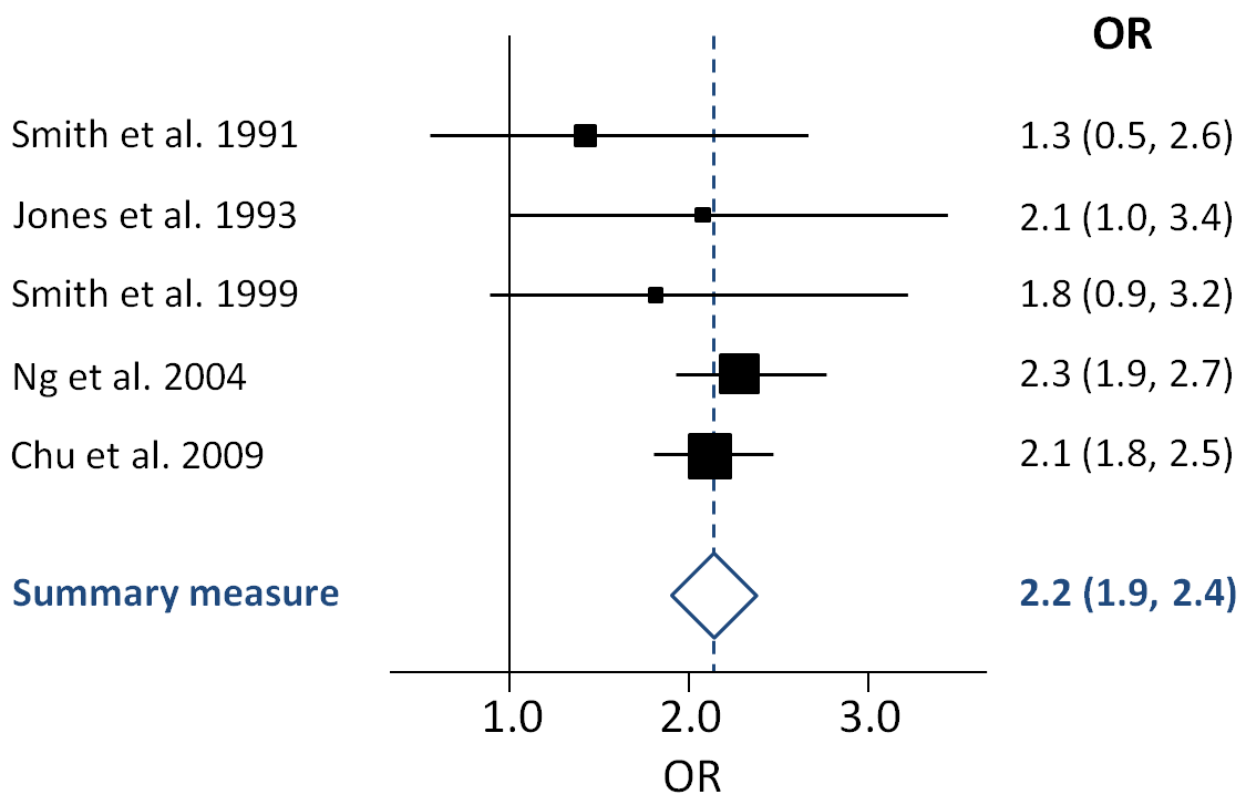
A forest plot summarises effect sizes from several studies and their confidence intervals, making it easy to see whether results agree, conflict, or cluster around ‘no effect’. Wide or non-overlapping confidence intervals visually signal uncertainty and inconsistency, encouraging interpretation based on the overall body of evidence. This is a common way biologists and clinicians judge how strong and consistent the evidence is across multiple datasets. Source
This is common in real biological research and should not be ignored.
Conflicting evidence can arise because of:
different ways of recording disease
changes in diagnostic criteria
incomplete or inaccurate records
variation between populations
short-term random fluctuation
differences in how causes of death are assigned
This means that one dataset may suggest a strong risk, while another suggests a weaker risk or no clear pattern. Rather than choosing the most dramatic result, biologists compare the evidence as a whole.
A sensible interpretation asks:
Which result is most consistent with other evidence?
Are the differences small enough to be explained by normal variation?
Could the conflict come from measurement or classification differences?
Does the evidence still suggest an overall pattern, even if not every dataset matches perfectly?
Recognizing conflicting evidence is part of good scientific thinking. It prevents overconfident claims and encourages judgments based on the balance of evidence, not isolated figures.
Common mistakes in data interpretation
Some errors appear repeatedly in illness and mortality questions:
assuming more deaths always means higher risk
ignoring population size and comparing only totals
treating correlation as definite proof of causation
overlooking important differences between populations
focusing on a single striking result instead of the broader pattern
dismissing all evidence because one dataset conflicts with another
Careful interpretation means asking what the numbers actually show, what they do not show, and how confidently they support a claim about health risk.
Practice Questions
State what is meant by correlation and explain why correlation alone does not prove causation. (2 marks)
Correlation is a relationship or association between two variables. (1)
It does not prove causation because another factor may be responsible, or the link may be coincidental. (1)
A report compares mortality from disease Z in three regions.
Region A: 180 deaths per 100,000 people
Region B: 95 deaths per 100,000 people
Region C: 175 deaths per 100,000 people
The report also states that Regions A and C have a higher level of exposure to factor X than Region B.
Use the data to assess whether factor X causes disease Z.
(5 marks)
Region A and Region C have higher mortality rates from disease Z than Region B. (1)
This suggests a positive association or correlation between exposure to factor X and mortality from disease Z. (1)
The data do not prove causation. (1)
Another variable could explain the pattern, such as differences between the populations. (1)
Stronger support for causation would require more evidence, such as repeated results from other datasets or studies. (1)
FAQ
Age-standardized rates adjust data so populations with different age structures can be compared more fairly.
Without standardization, a country with more older people may seem less healthy simply because many diseases are more common in old age.
This makes age-standardized rates especially useful when comparing:
different countries
different time periods
groups with very different population structures
Screening can detect cases that would otherwise have remained undiagnosed.
This can make illness rates appear to rise even if the actual number of people developing the disease has not changed.
It may also:
identify milder cases
detect disease earlier
increase recorded prevalence because people live longer after diagnosis
So a rise in recorded illness does not always mean the disease has become more common biologically.
A more sensitive test can detect cases that older methods missed.
As a result, the recorded number of cases may increase sharply after the new test is introduced, even if the underlying risk in the population is unchanged.
This matters because trends over time may reflect:
better detection
changes in diagnostic thresholds
improved reporting systems
Biologists must check whether the method of diagnosis stayed the same before comparing older and newer data.
The ecological fallacy happens when patterns seen in whole populations are assumed to be true for individuals within those populations.
For example, if a region has both high mortality and high exposure to a factor, that does not prove that the people who died were the ones with the exposure.
This matters because population-level data are useful for spotting patterns, but they can overstate certainty about individual risk.
Case fatality rate is the proportion of diagnosed cases of a disease that result in death.
It can help distinguish between:
a disease becoming more common
a disease becoming more deadly
For example, mortality might fall because treatment improves, even if the number of cases stays similar.
Looking only at total deaths may hide this. Case fatality rate can therefore give extra insight into whether changes reflect disease frequency, disease severity, or medical care.