
IB Syllabus focus: 'Data can be represented in graphs, tables and plots based on study design and data type.'
In psychology research, the way data are displayed affects how clearly findings can be understood. Choosing an appropriate graph, table, or plot helps reveal patterns, comparisons, and limitations accurately.
Why data representation matters
Psychological research often produces many scores, categories, or observations. If these remain as raw data, important patterns can be difficult to identify. A well-chosen visual or structured display allows researchers to communicate findings clearly and helps readers interpret results more efficiently.
Data representation: The organized display of research findings in visual or structured form so patterns, comparisons, and relationships can be identified.
The choice of representation should depend on two main factors: data type and study design. If either is ignored, the display may confuse the reader or suggest a misleading interpretation.
Graphs are useful for seeing patterns quickly.
Tables are useful when exact values are important.
Plots are especially useful for relationships, distributions, and unusual cases.
Matching the display to data type
Categorical data
Some psychology data are made up of labels or group membership rather than measured amounts. These displays should focus on how often each category appears.
Categorical data: Data sorted into labels or groups rather than measured on a numerical scale.
Examples include diagnosis categories, response options, or attachment classifications. Suitable ways to present categorical data include:
Frequency tables, which list each category and its count
Bar charts, which compare categories clearly
Pie charts, which may be used when showing proportions of a whole, although they are often less precise than bar charts
Bar charts are appropriate because the bars are separated. This shows that the categories are distinct and not part of a continuous scale.
Quantitative data
Other studies produce numerical scores. These need displays that preserve order and make the shape of the data easier to judge.
Quantitative data: Data expressed as numbers, often showing amount, score, frequency, or measurement.
Examples include memory scores, reaction times, questionnaire totals, or stress ratings. Suitable displays include:
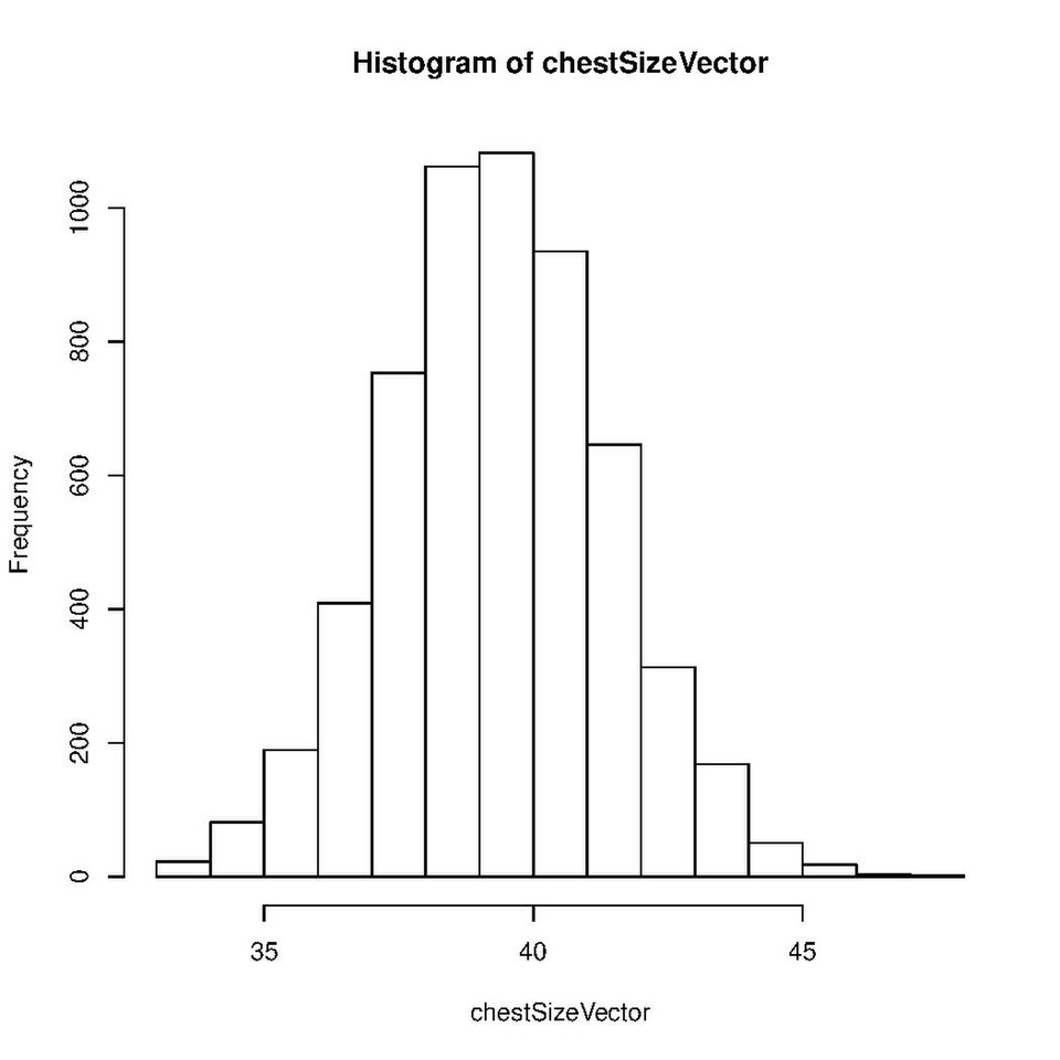
This histogram shows a quantitative variable grouped into adjacent intervals (bins) on the x-axis, with frequency on the y-axis. It helps readers quickly judge the overall distribution (e.g., where scores cluster and how spread out they are), which is often harder to see from raw scores alone. Source
Tables for exact numerical results
Histograms for grouped continuous data
Line graphs for ordered data such as time, trials, or sessions
Box plots when the aim is to compare distributions and notice spread or unusual scores
A line graph is usually appropriate only when the horizontal axis has a meaningful sequence. If the categories are not ordered, a bar chart is usually more accurate and easier to read.
Matching the display to study design
Comparing groups or conditions
Study design influences how readers understand the data. In research comparing separate groups or conditions, a bar chart often gives a clear visual comparison. This is useful when the goal is to show differences between conditions, groups, or response categories.
In repeated-measures designs, the same participants are measured across time or across several ordered conditions. A line graph can show how scores change across that sequence. The connected points indicate progression, so the reader can see whether scores increase, decrease, or remain stable.
Tables may also be appropriate when the reader needs exact values in each condition rather than a broad visual impression.
Showing relationships and patterns
When the purpose of a study is to examine whether two variables are related, a scatterplot is often the best choice. Each point represents a pair of scores. This allows the viewer to judge whether higher values on one variable tend to be associated with higher or lower values on the other.
Scatterplots are also useful because they can reveal unusual cases that may affect interpretation.
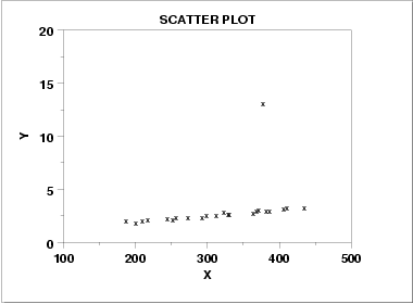
This scatterplot illustrates how most points can follow an overall linear pattern while a single point lies far from the main cluster (an outlier). It’s a concrete visual reminder that a relationship can look different once unusual cases are identified and considered carefully. Source
Outlier: A data point that lies unusually far from most other values in a dataset.
An outlier should be noticed and considered carefully. It may reflect measurement error, an unusual participant, or a meaningful exception in the data.
Reading graphs, tables, and plots accurately
Interpreting a display involves more than noticing the tallest bar or lowest score. Readers should look for:
Overall pattern: Is there a clear difference, trend, or relationship?
Magnitude: Does the display suggest a small or large difference?
Consistency: Are values tightly grouped or widely spread?
Exceptions: Are there outliers, gaps, or irregular clusters?
Fit: Does the chosen display match the kind of data collected?
Good representations should also include essential features:
a clear title
labeled axes
units where needed
an appropriate scale
a key or legend if more than one group is shown
Scales are especially important. If axis intervals are uneven or the scale is too restricted, small differences may appear much larger than they really are. Accurate interpretation depends not only on the data themselves but also on how honestly the display presents them.
Common errors in interpretation
A display can be neat and attractive but still be inappropriate. Common problems include:
using a line graph for unrelated categories
using a bar chart when the aim is to show a relationship between two variables
overcrowding a display with too many categories
omitting labels, units, or a legend
assuming a visible difference automatically means an important finding
Interpretation must also stay within what the representation can actually show. A scatterplot may suggest a relationship, but it does not by itself prove cause and effect. A bar chart may show differences between groups, but readers still need to consider the design of the study before making strong claims. Poorly chosen or poorly read displays can therefore lead to misleading conclusions about psychological data.
Practice Questions
[2 marks]
Identify one suitable data representation for categorical data and one suitable data representation for quantitative data in psychology research.
1 mark for a suitable representation of categorical data, such as a bar chart, pie chart, or frequency table.
1 mark for a suitable representation of quantitative data, such as a histogram, line graph, box plot, or table.
Award credit only if the examples are appropriate to the named data types.
[6 marks]
Explain how both data type and study design influence the choice of graphs, tables, and plots in psychological research.
Award 1 mark for each relevant point, up to 6 marks.
Data representation should match the type of data collected.
Categorical data are often shown using bar charts or frequency tables.
Quantitative data are often shown using histograms, line graphs, box plots, or tables.
Line graphs are appropriate when data are ordered, such as across time or trials.
Bar charts are useful for comparing groups or conditions.
Scatterplots are appropriate when showing the relationship between two variables.
Tables are useful when exact values are needed.
A suitable explanation of why the chosen display fits the study design or data type can earn credit.
FAQ
A stem-and-leaf plot is most useful when the dataset is fairly small and the researcher wants to keep the original values visible. It shows the shape of the distribution without losing the exact scores.
This can be helpful in:
classroom investigations
pilot studies
quick checks for gaps, clusters, or extreme values
For large datasets, it usually becomes too crowded and less practical than a histogram or software-generated plot.
Adding individual points can show how much overlap exists between participants or groups. This prevents a graph from hiding important variation behind a single average.
It is especially useful when:
the sample is small or moderate
there may be extreme scores
the researcher wants transparency about spread
A graph with only summary bars can make two groups look very different even when many individual scores are similar.
Researchers should avoid relying on color alone to separate groups. If two lines differ only by red versus green, some readers may not be able to tell them apart.
Better design choices include:
high-contrast colors
different line styles, such as dashed versus solid
direct labels on lines or bars
patterns or shading in addition to color
Accessible design improves interpretation for everyone, not only for readers with color-vision differences.
Missing data should be handled openly rather than hidden. If values are absent, the graph or caption should make that clear so readers do not assume all cases were included.
Good practice includes:
stating the number of missing cases
explaining whether missing scores were excluded or estimated
avoiding lines that connect across missing points without explanation
This matters because missing data can change the apparent pattern and may affect how representative the display is.
Three-dimensional bars, shadows, and heavy visual effects can distort how large values appear. They often make precise comparison harder, not easier.
Scientific displays should prioritize clarity over decoration. In most cases, simple two-dimensional graphs are better because they:
reduce visual distraction
make heights and distances easier to compare
lower the risk of misreading the data
A cleaner display supports more accurate interpretation.
